Colors serve as silent messengers, conveying emotions and perceptions to viewers. Understanding their impact is crucial for effective design.
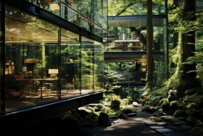
Brands often utilize colors to communicate their message and elicit specific feelings from potential clients and customers, and utilize 3D visualizations as a marketing strategy to present their products or services in an eye-catching manner.
The Power of Color Nuances
At The Crow Studio, we understand that the subtle nuances of color can transform a design from ordinary to extraordinary. In 3D visualization, every hue, shade, and gradient can evoke specific emotions. These colors influence perceptions and shape how a space is experienced.
Whether it’s the soft transition from a warm amber to a deep sunset orange or the delicate interplay of pastel tones, these color variations create depth, harmony, and mood within a project. Our expert designers use color nuances to craft visual stories that resonate with your audience. We ensure that your designs communicate your intended message on a subconscious level.
Color nuances aren’t just about aesthetics; they’re a strategic tool that can make or break a design’s effectiveness. Whether you want to evoke tranquility in a residential space or convey energy in a commercial project, our expertise in color nuances can help. We use color precisely to meet your design goals. Our mastery ensures impactful and effective results.
Mastering Color Gradations in Design
Color Grading is an integral component of post-production that allows filmmakers to craft compelling stories through visual narrative. Color Grading gives your viewers an emotional journey alongside your characters as you create an environment in which they can become immersed in.
Color has long been studied as it relates to emotions, with numerous studies exploring its correlation with hue, saturation, brightness, valence, and other components of visual stimuli.Past research often used predetermined color ranges to link with emotions. However, recent studies reveal a more complex connection between colors and emotions.
Spike Lee‘s Do the Right Thing stands out in particular with its different levels of saturation in comparison to his other films with similar color schemes; this gradation can produce very different emotional responses in viewers.
Impact of Broken Colors
Color has an undeniable influence on our emotions. That is why choropleth maps of election results showcase voters by color group, or why living rooms filled with multiple wall colors can evoke strong reactions like anger or sadness in us.
Traditional analyses of film colors rely on verbal description, often overlooking aesthetic and emotional dimensions. With database-driven analysis tools and deep learning software being employed by this research project (ERC Advanced Grant Film Colors), this holistic approach to exploring film colors is taken.
Image plots in perceptually uniform color spaces highlight relationships between hues rather than individual hues. These plots focus on attributes like temperature, saturation, and value. They also reveal how these relationships can be understood through spatial variation or figure-ground separation.
Creative Color Combinations
3D Visualization enhances understanding of scale and spatial relationships. It also supports collaboration and decision-making. Additionally, it provides immersive experiences. These benefits make it essential across various industries.
Color can evoke specific emotions such as anger, fear or joy and its effect varies between individuals. Yellow may elicit feelings of happiness and optimism while red might trigger feelings of anxiety or speed.
Visual representations that enable an analysis of a film’s color distribution provide invaluable insight into its aesthetic characteristics. Traditional time-based representations, like movie barcodes and mosaics, provide broad overviews. However, they don’t capture fine-grained color shifts effectively. For detailed color variations, these methods fall short. Such representations include image plots and z-projections as well as deep learning methods for figure-ground separation [Pasue and Walkowski 2018].
Saturation’s Emotional Influence
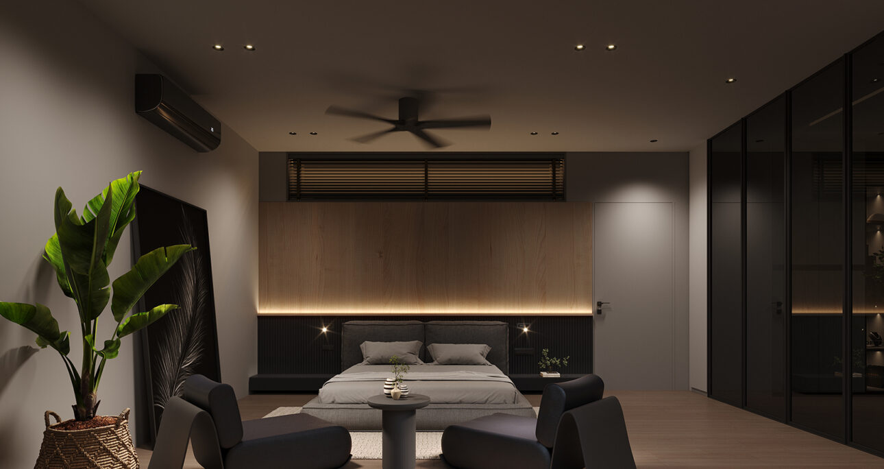
As we move through our environments, We experience different moods based on color. A light or earth-toned space often elicits feelings of relaxation. In contrast, vibrant or densely saturated hues can make us feel excited or agitated. These color responses can trigger specific emotions. The intensity of these feelings can be influenced by the saturation and brightness levels of the colors used.
Researchers employed established color-emotion associations from previous face-to-face communication research in their comparison of emoticons (pictorial symbols that represent human facial expressions) rendered in different colors for recognition purposes. As with face-to-face communication research, congruent color/emotion pairing facilitated emoticon recognition; on the contrary, semantically incongruent colors decreased recognition rates significantly.
Light orange rendering evoked an increased Happy AM estimate; similarly, Sad emoticons produced more significant Sad AM estimates when rendered in Cyan and Blue rather than Red Yellow Green or Orange. Neutral emoticons were judged most accurately as “no emotion”.
Analogous and Triadic Harmony
Color harmonies are used in visual design to achieve balance and harmony. Color harmonies depend on relationships within a color wheel. Examples include monochromatic colors, which use variations of one hue. Complementary colors are opposite each other on the wheel. Analogous colors sit next to each other, creating smooth transitions. Triadic colors form a triangle on the wheel, offering balanced contrast.
Analogous harmonies combine different shades, tints, and tones of one color in order to produce a subtle yet harmonious effect that is often soothing. A variation of this technique is the split-complementary scheme. It uses a key color along with two colors adjacent to its complement. This approach creates strong contrast. At the same time, it maintains less tension between the key and secondary colors.
However, this type of color scheme could fail color deficiency tests for some individuals. Furthermore, more colors you use means it becomes harder to maintain visual hierarchy – an issue particularly evident when working with large datasets.
Understanding Color Value
Color can play a vital role in design. Hue plays a key role in design, influencing emotions from smartphone curves to wellness app colors. Reds evoke passion, while blues offer serenity. These color choices are crucial in creating designs that resonate emotionally.
While color wheels often highlight hue and chroma, value – the lightness or darkness of hues – should also be taken into account. Dark values (closer to black) reflect less light while lighter values such as white and yellow reflect more.
Researchers have recently discovered that smell has a stronger influence than color on our senses. It affects our sense of arousal, satisfaction, and behavioral intentions. This finding highlights the significant impact of olfactory stimuli compared to visual stimuli. Therefore, when selecting hues with proportionate precision for emotionally engaging design projects and considering value as a factor.